
Place As Process
MFA Thesis
Place As Process surveys the history of Black Mountain College and documents its legacy through typography. In this project I continued my research on Black Mountain that I had begun with Epicenter. Only open 24 short years from 1933-1957, Black Mountain College defined American design education and became a hub of America’s most influential arts and designers. It was much more than a school, it was an experiment in creative community.
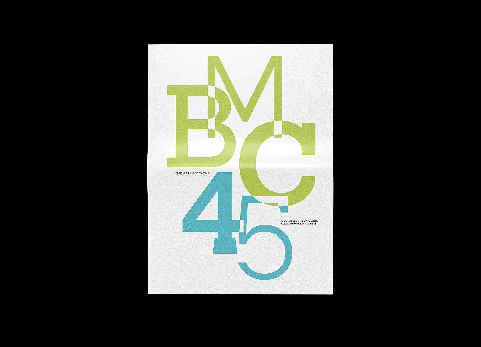
This thesis project uses variable font design to capture the typographic spirit of Black Mountain. My font, BMC45, pays homage to the school’s extraordinary 1945 summer session which was a pivotal moment for the field of graphic design within the community. In this project, I used typography to preserve and share this story, giving today’s designers a way to interact with Black Mountain in their own practices.
Special Thanks:
Heather South (Lead Archivist, Western Regional Archives, Asheville, NC) for research assistance
Sean Adams, Gloria Kondrup, and Samantha Fleming for thesis advising
I began my thesis research by compiling the above timeline of Black Mountain College, mapping key players and their time at the school. This helped me understand the life of the college and how each person influenced others. After compiling this timeline, I noticed a sparce block of time in the middle of the school’s lifespan. I discovered this block of time fit during the dates of WWII. Through creating this timeline, I began to see how current events affected the life of the community.
This timeline was compiled from research by Mary Emma Harris (The Arts at Black Mountain, 1987).
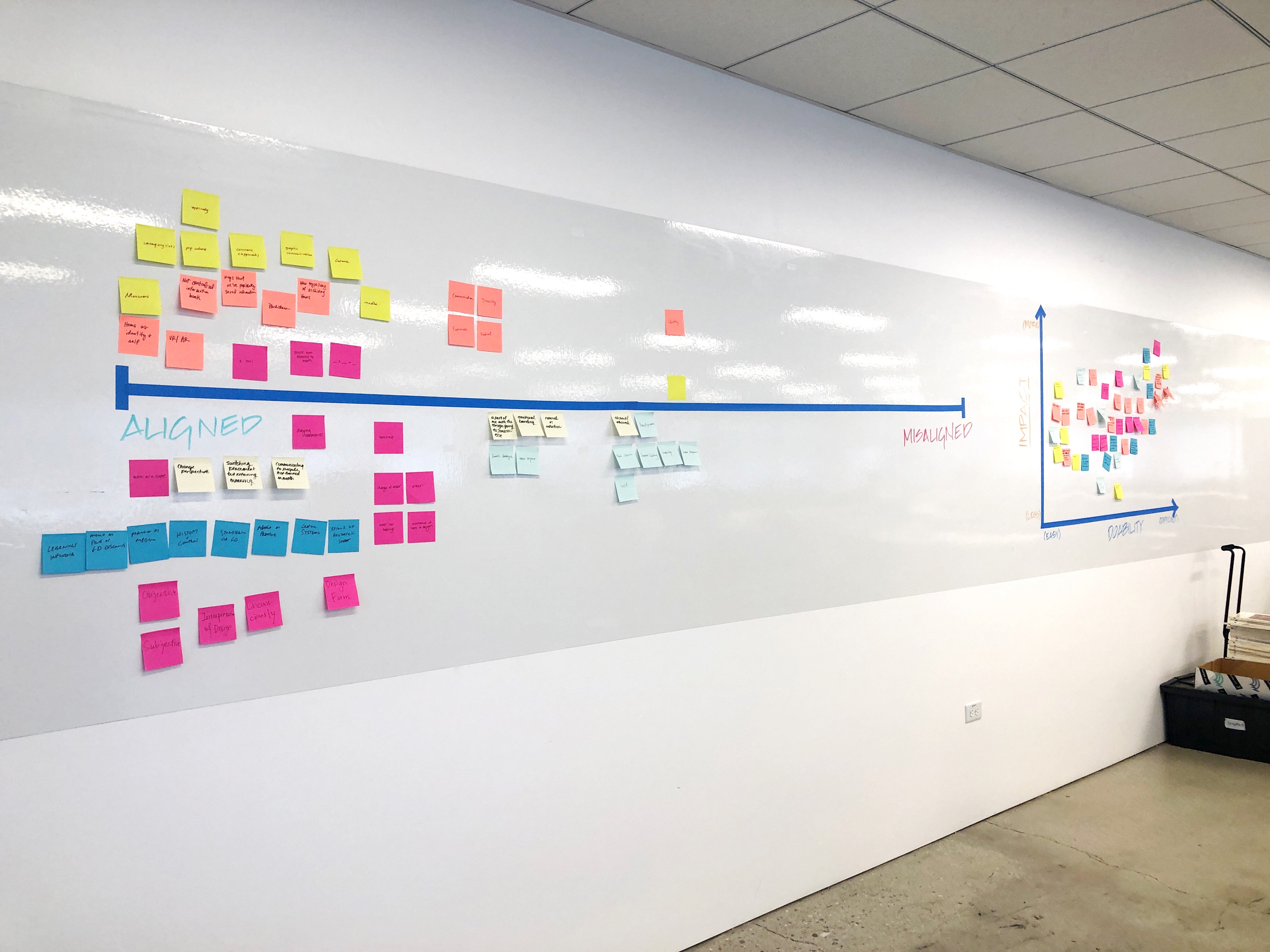
As I gained an understanding of Black Mountain College’s core mission and teaching praxis, I wanted to put these ideas into practice. I organized and developed a thesis planning workshop for my ArtCenter MGx Thesis peers with exercises to help them test their own project ideas in a group setting.
This workshop helped me see how community and place are organic forces that shape the design process. This informed my thesis concept, Place As Process.

In researching Black Mountain College, I considered the ways in which I was encountering this story. I was discovering this community through the record of photography and typography. Most of my research was from archival records at the Western Regional Archives in Asheville, North Carolina.
I browsed student notes, letters to home, and college publications. I realized that typography documented this organic force of place. I began to see Black Mountain’s sense of place within its geographic location and its moment in time.
The photos below are from college publications printed at the Black Mountain College Print Shop. Images courtesy of the Western Regional Archives.

I wanted to create a way for today’s designers to interact with this extraordinary story of Black Mountain College, so I decided to design a font capturing the typographic spirit of the community.
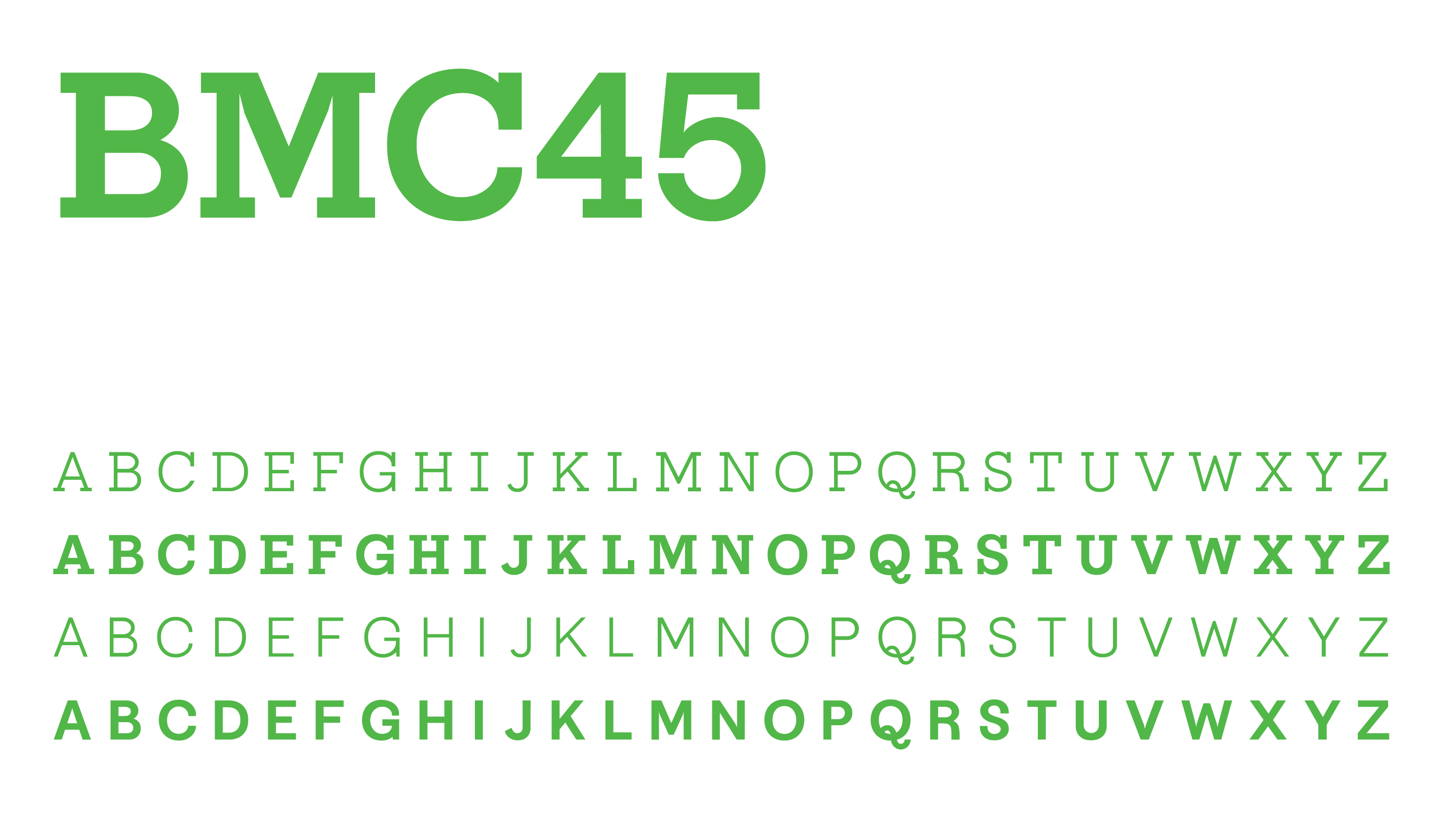
I developed a variable font with four masters and two variable axes of weight and retracting serifs. My font, BMC45 pays respect to the school’s 1945 Summer Session which was a pivotal moment for the field of graphic design within the community.


Each of the four static masters of the font were developed from archival materials from Black Mountain College.
Images courtesy of the Western Regional Archives.

Planning BMC45’s variability axes was a uniquely difficult task. I considered many different forms of variability like contrast or width. In the end, I chose weight and serifs because it gave me more opportunity to capture the breadth of Black Mountain College’s typographic voice.
Pictured left below is Black Mountain College’s original seal designed by Josef Albers. Right is the reimagined seal using BMC45 Bold Serif.


BMC45 is an ongoing project. If you would like to try a beta version of this font, please submit a request︎︎︎
©2022 Anna Thomas