
OrphanWise
OrphanWise is a Tennessee-based non-profit that trains caregivers of at-risk or traumatized children in trauma-informed care. I designed this new brand identity to amplify their mission to families, donors, and their community. The main challenge in this project was to communicate OrphanWise’s goal to care for children while connecting with their primary audience—adults.
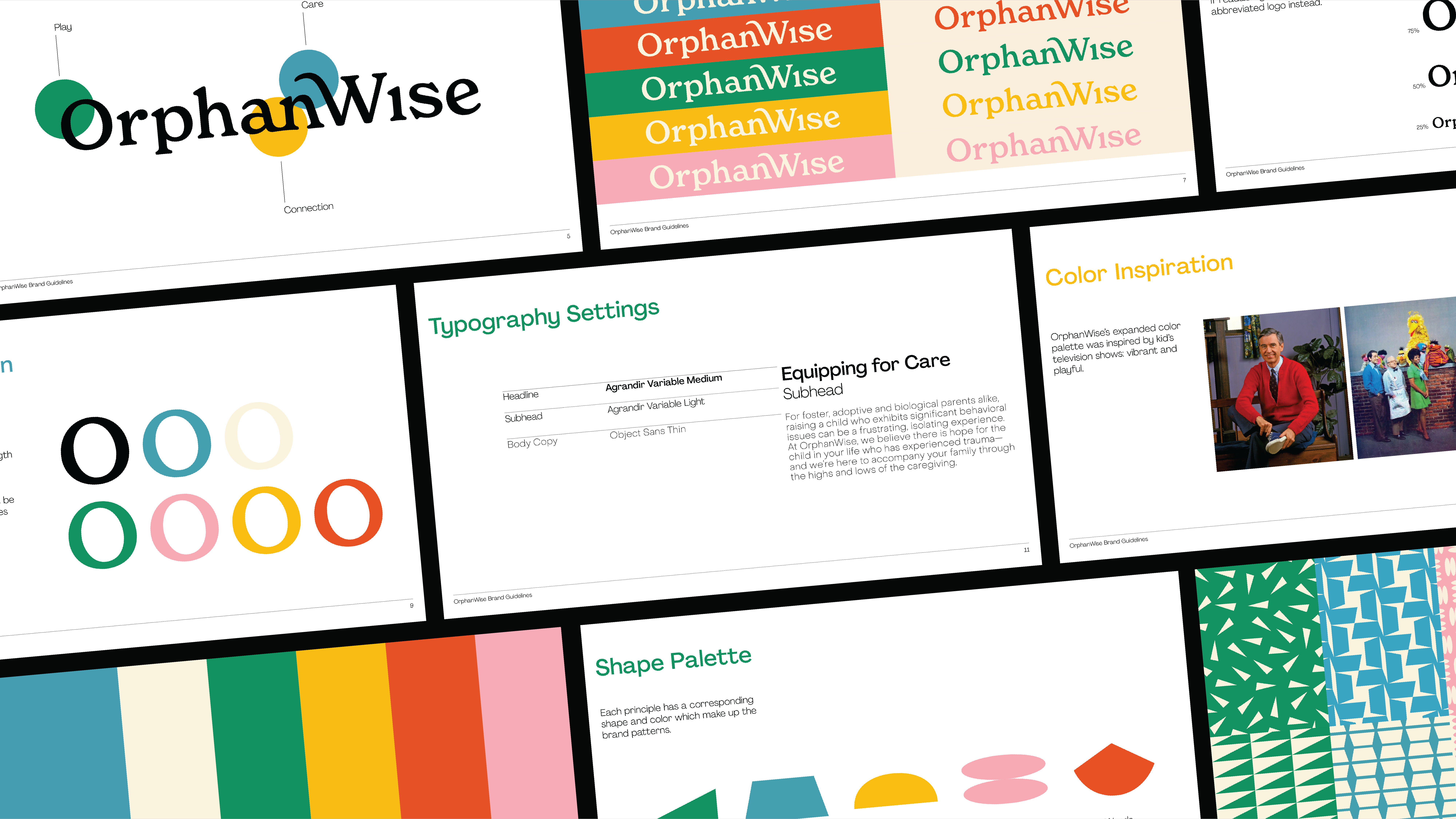
OrphanWise Brand Key words above connect to trauma-informed care principles and to the spirit of the organization.
The OrphanWise logo embodies their three values of play, care, and connection.


OrphanWise’s color palette was inspired by classic children’s tv shows. It’s designed to be bright and cheerful, yet refined.
Below is the shape palette I designed for OrphanWise. The shapes represent the principles of trauma-informed care used by the organization.

OrphanWise’s shape palette expands into playful patterns used to add dimension to the brand identity.
One of the key goals of this project was to create ways to connect with OrphanWise’s donors. Above is the donor package that includes informational pieces on OrphanWise’s methods, growth projections, and goals for the future.
Below is the organization’s refreshed social media with sticker gifs that encourage trainees to share about OrphanWise.

©2022 Anna Thomas