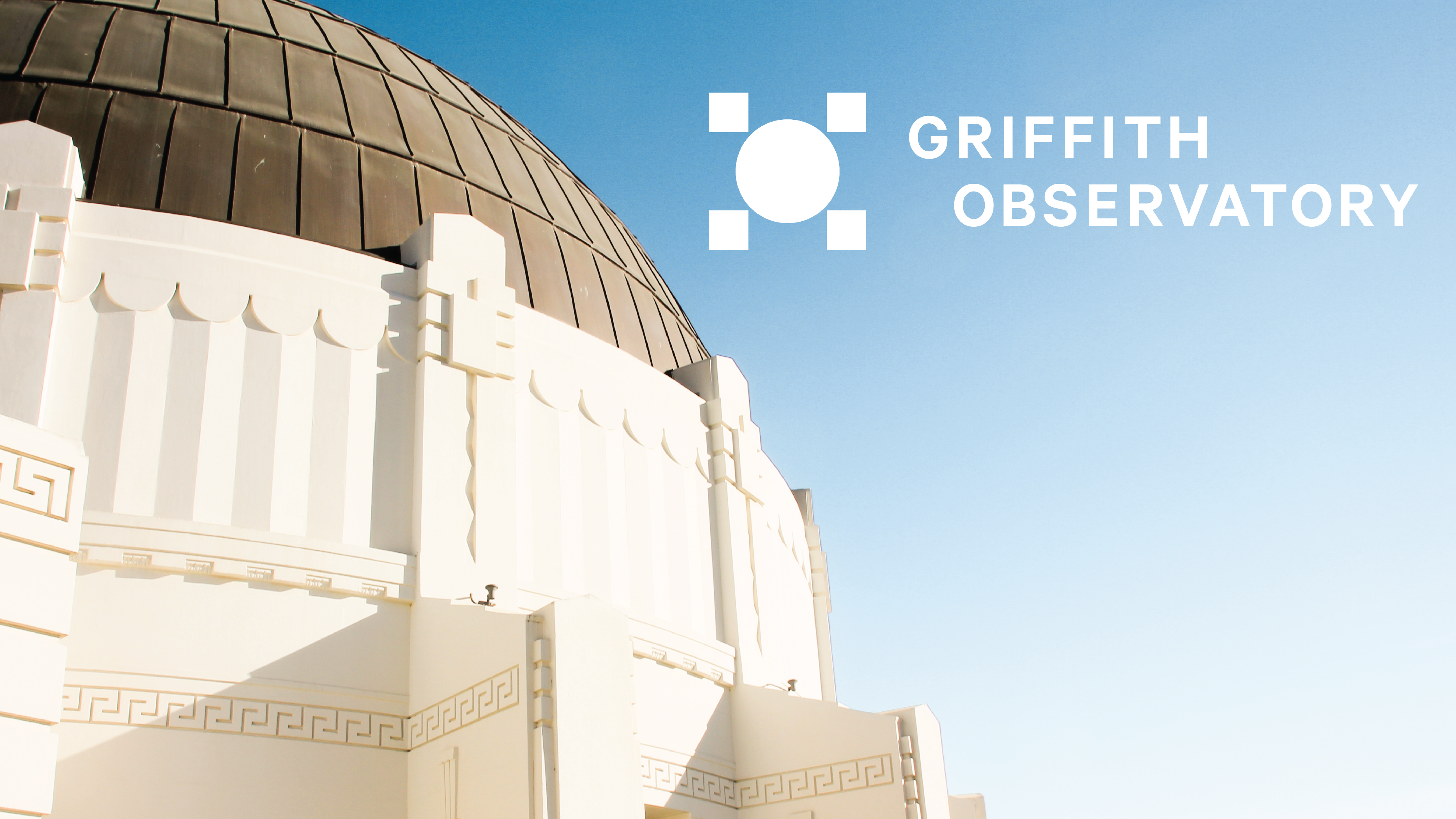
Griffith Observatory
Griffith Observatory is one of Los Angeles’ most beloved institutions operating with the mission to transform lives through astronomy. The challenge in crafting a new brand for the observatory was to honor its cultural legacy while looking to the future of astronomy exploration—blending art with science. Using the original Art Deco architecture as a North Star, I developed a system of graphic symbols to represent how the observatory helps visitors observe, experience, and learn about space.
Special Thanks:
Erin Male, Gift Shop Illustration Series
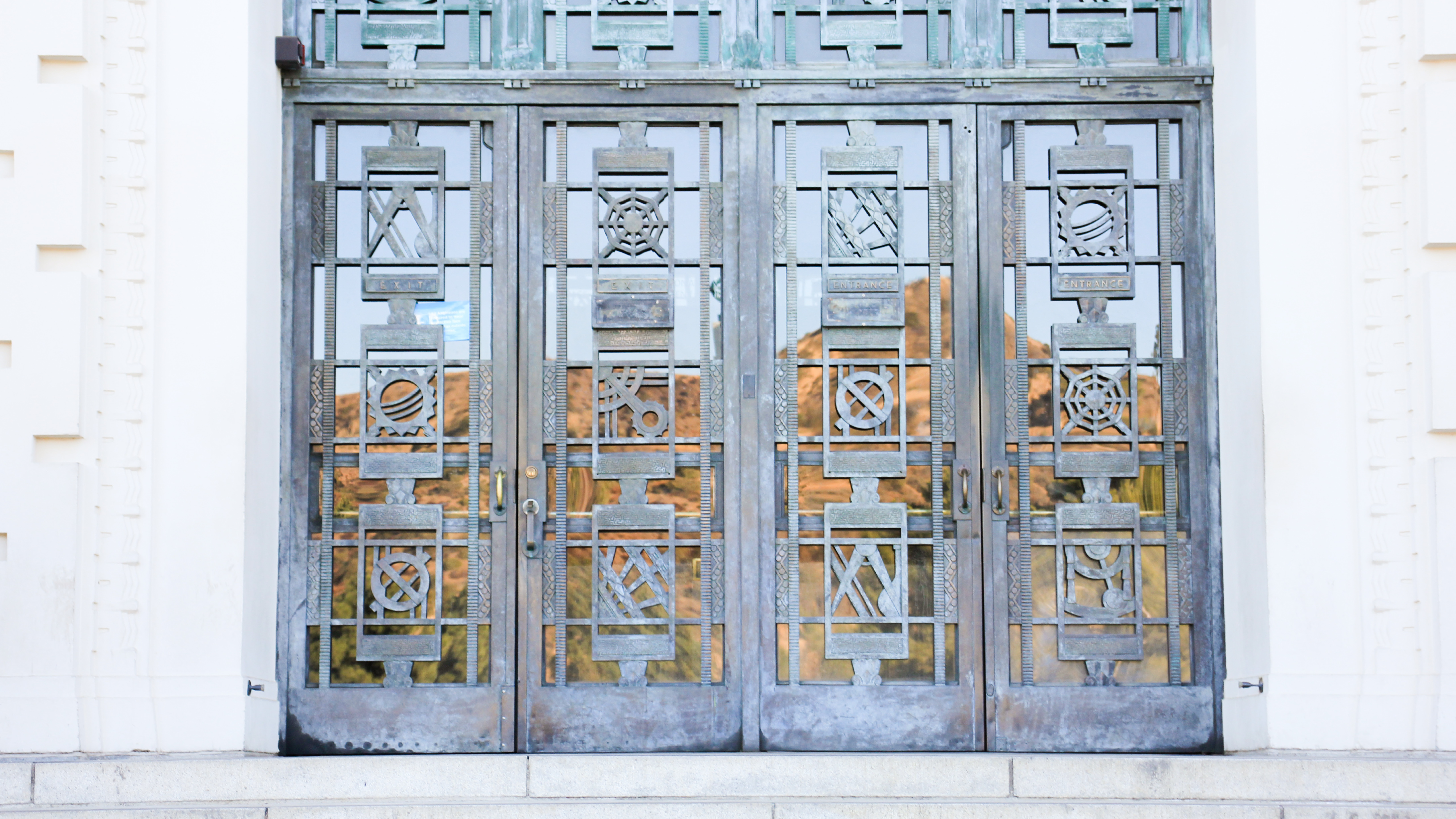

The original Art Deco ironwork on the doors of the observatory served as inspiration for the symbols I created to represent the brand identity. The seven symbols are representative of key astronomy tools and instruments.
The system of symbols reveals imagery to the viewer, positioning the observatory as a gateway to astronomy.


Creating a way for the audience to interact with the observatory off-site was vital to this project. It was designed during the Covid-19 pandemic when many cultural institutions were struggling to adapt to changing restrictions. Griffith Observatory’s new website above is complete with an interactive space exploration experience.
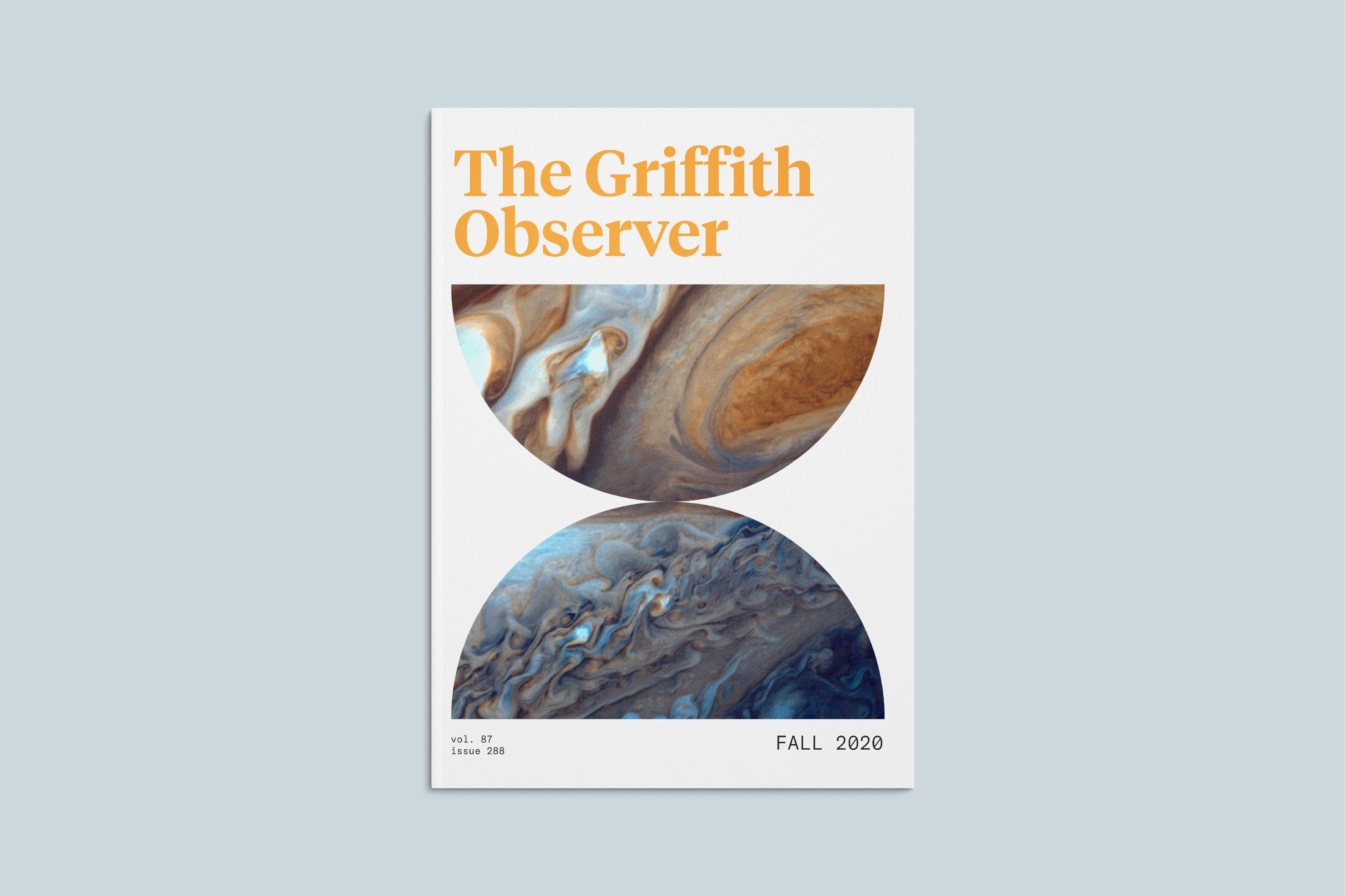
The Griffith Observer has been published by the observatory since 1944. Redesigning it was important to preserve this piece of the brand’s legacy.
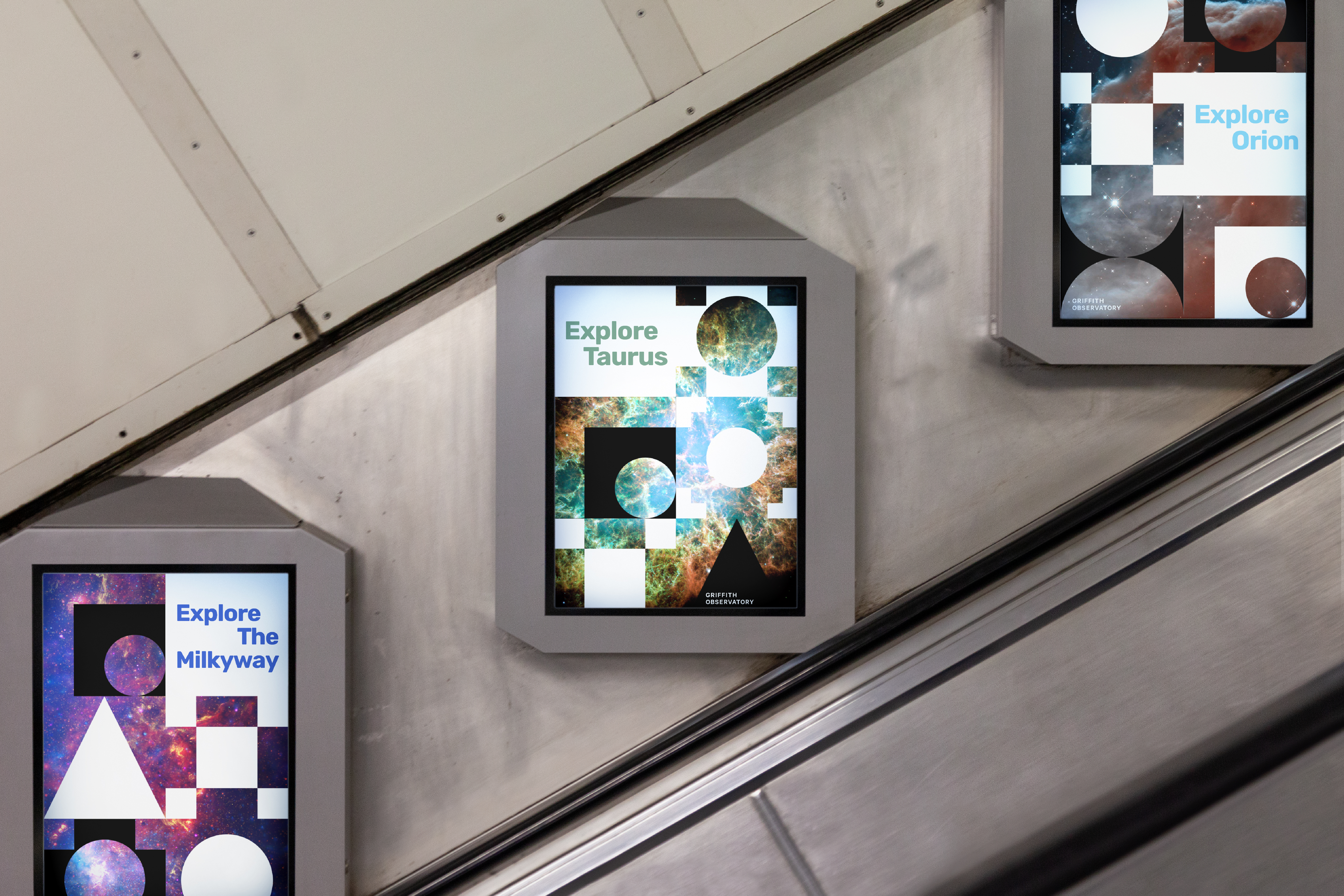
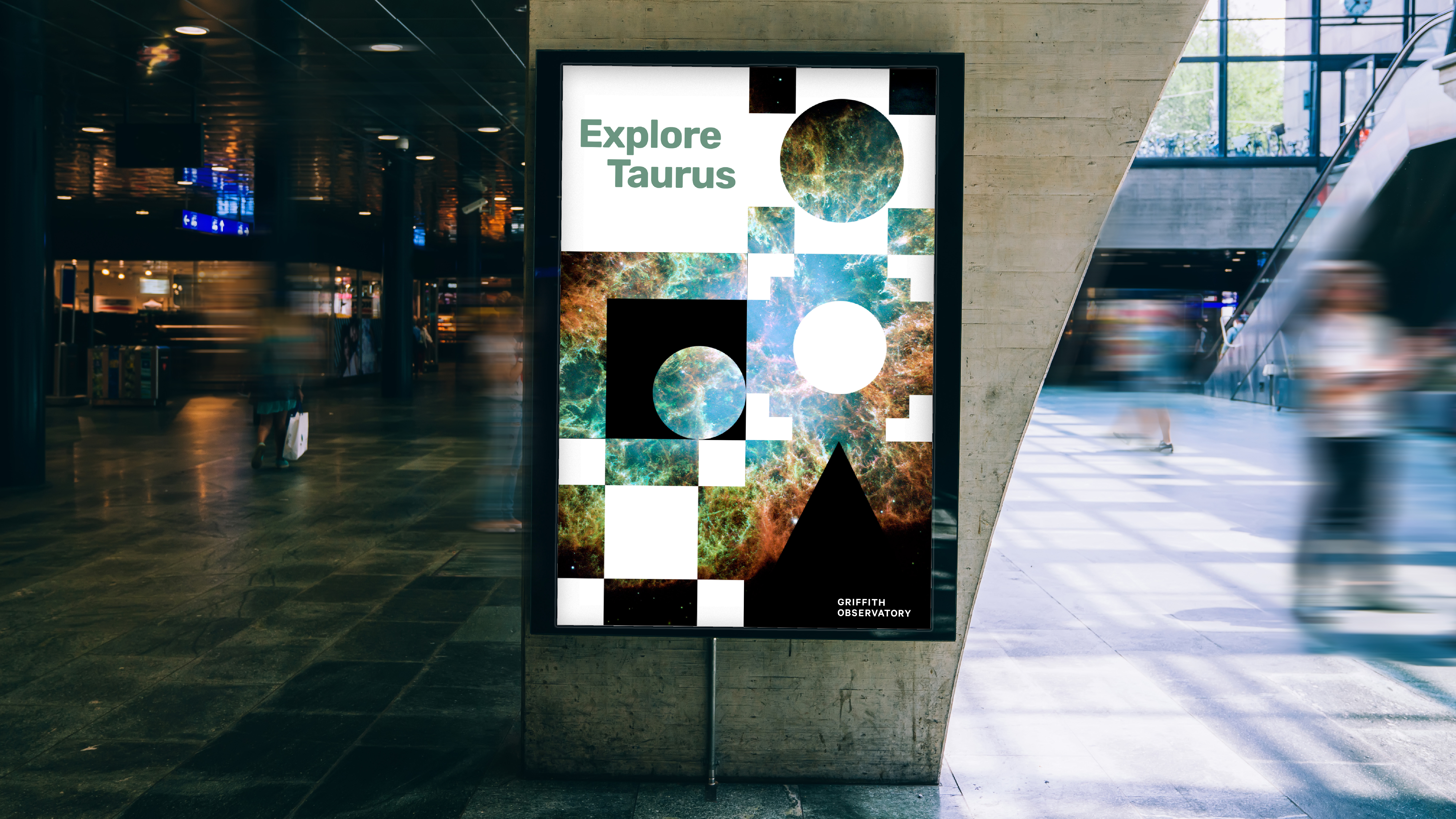
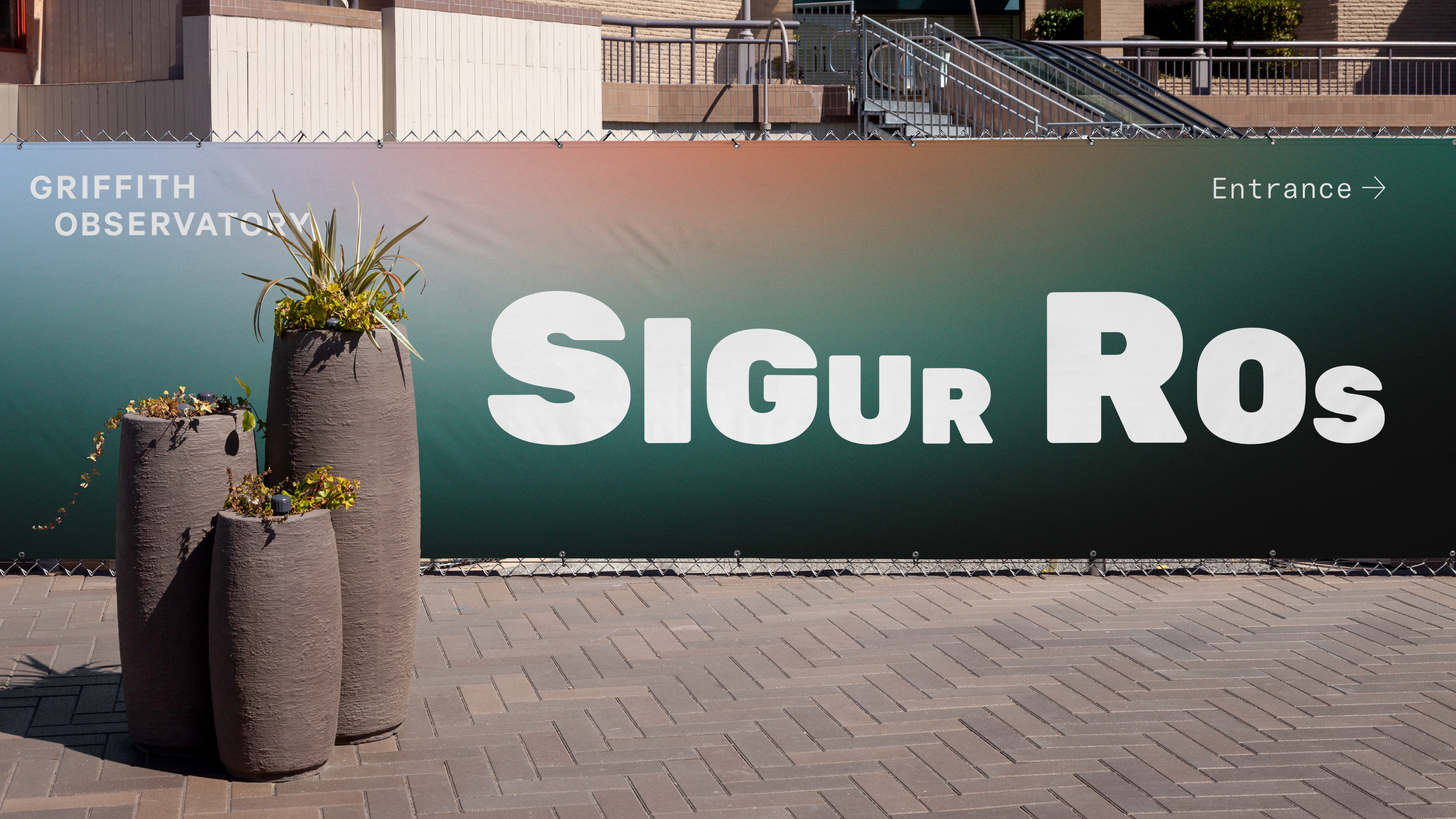
I created an on-site campaign that connected to the observatory’s cultural history in the arts. The on-site series is advertised through billboards, posters, and wayfinding signage.


To create Griffith’s gift shop merchandise, I collaborated with local artist, Erin Male who created beautiful, hand drawn illustrations that capture the experience of being at the observatory.


©2022 Anna Thomas